


Hello friends,
In this article, I will show you how you can create custom widgets in Flutter using Widget Composition. As you know Flutter is cross Platform, so this is gonna work for both Android and iOS.
Watch Video Tutorial
Let’s start now.
I am going to create a custom button just like you see in the below image.

Custom Button in Flutter
First thing to do is to create a new dart file named “custom_button.dart” inside you ‘lib‘ folder or any folder inside ‘lib‘.
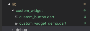
My Folder structure is like this
Folder Structure
Now we will create the custom class inside the ‘custom_button.dart‘.
Our Custom Button has one parameter in the constructor which is a onPressed function that is going to be called when user taps on the button.
CustomButton({@required this.onPressed});final GestureTapCallback onPressed; |
Then we will add a ‘Row’ Widget with widgets ‘Text’ and ‘Icon’ as Children. We will add ‘SizeBox’ in between the ‘Text’ and ‘Icon’ to add some space.
The Text Widget will look like this.
Text( "Tap Me", maxLines: 1, style: TextStyle(color: Colors.white),) |
As you see, you can style the ‘Text‘ with the ‘style‘ property.
Custom Button – Complete Code
The whole custom button Code will look like this.
import 'package:flutter/foundation.dart';import 'package:flutter/material.dart';class CustomButton extends StatelessWidget { CustomButton({@required this.onPressed}); final GestureTapCallback onPressed; @override Widget build(BuildContext context) { return RawMaterialButton( fillColor: Colors.green, splashColor: Colors.greenAccent, child: Padding( padding: EdgeInsets.all(10.0), child: Row( mainAxisSize: MainAxisSize.min, children: const <Widget>[ Icon( Icons.face, color: Colors.amber, ), SizedBox( width: 10.0, ), Text( "Tap Me", maxLines: 1, style: TextStyle(color: Colors.white), ), ], ), ), onPressed: onPressed, shape: const StadiumBorder(), ); }} |
‘StadiumBorder()‘ to give the curved effect for the button.
‘Padding‘ widget is added to give padding for the whole widget. Padding Widget will accept only one child. RawMaterialButton is the parent component that comes from material library in Flutter. GestureTapCallback handles the tap on the button.
Our Custom Button is done.
Use it
In the parent widget component, import the custom_button.dart and add as like a normal widget. Don’t forget to give the ‘onPressed’ property as it is a required one.
class _CustomWidgetDemoState extends State<CustomWidgetDemo> { @override Widget build(BuildContext context) { return Scaffold( appBar: AppBar( title: Text(widget.title), ), body: Center( child: Column( mainAxisAlignment: MainAxisAlignment.spaceEvenly, children: <Widget>[ Text("here is a custom button in FLutter"), CustomButton( onPressed: () { print("Tapped Me"); }, ) ], ), ), ); }} |
Source Code
Get the complete source code from here.
Thanks for reading. Please leave your valuable comments below.
what if the text styles are already defined, and the text can be of different colors on each page, I’m not talking about the button now, butwhat if the text styles are already defined, and the text can be of different colors on each page, I’m not talking about the button now, but the usual title, as it will be then. what does a reused widget look like? the usual title, as it will be then. what does a reused widget look like?
/// Headline 1 Bold White
static final TextStyle headline1White = TextStyle(
fontFamily: Assets.fonts.gilroyBold,
fontSize: 24,
height: 32 / 24,
fontWeight: FontWeight.w700,
color: AppColors.textFFFFFF,
);
/// Headline 1 Bold Pink
static final TextStyle headline1Pink = TextStyle(
fontFamily: Assets.fonts.gilroyBold,
fontSize: 24,
height: 32 / 24,
fontWeight: FontWeight.w700,
color: AppColors.textFF3C60,
);
You can make the color as parameter and set it from where it is being called. The Default can be your theme color.
Really nice, work like a charm