


Hello, welcome to another flutter tutorial.
This tutorial helps you to create a top TabBar navigation with AppBar.
The app will look like this below.
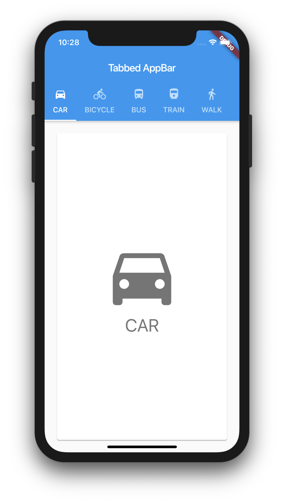
TabbedAppBar Flutter
Watch Video Tutorial
This is actually simple and easy.
Let’s start by creating the model class.
Our model class is named “Choice“.
class Choice {
  final String title;
  final IconData icon;
  const Choice({this.title, this.icon});
}
Now we will create a list of Choices and fill it with some dummy values.
const List<Choice> choices = <Choice>[
  Choice(title: 'CAR', icon: Icons.directions_car),
  Choice(title: 'BICYCLE', icon: Icons.directions_bike),
  Choice(title: 'BUS', icon: Icons.directions_bus),
  Choice(title: 'TRAIN', icon: Icons.directions_railway),
  Choice(title: 'WALK', icon: Icons.directions_walk),
  Choice(title: 'BOAT', icon: Icons.directions_boat),
];
Create the Tabs
Our Tab is another stateless widget and will have just an Icon and a text.
class ChoicePage extends StatelessWidget {
  const ChoicePage({Key key, this.choice}) : super(key: key);
  final Choice choice;

  @override
  Widget build(BuildContext context) {
    final TextStyle textStyle = Theme.of(context).textTheme.display1;
    return Card(
      color: Colors.white,
      child: Center(
        child: Column(
          mainAxisSize: MainAxisSize.min,
          crossAxisAlignment: CrossAxisAlignment.center,
          children: <Widget>[
            Icon(
              choice.icon,
              size: 150.0,
              color: textStyle.color,
            ),
            Text(
              choice.title,
              style: textStyle,
            ),
          ],
        ),
      ),
    );
  }
}
Add the TabBar
DefaultTabController is the widget used to create the TabBar.
We will supply this to the “home” property of the Material Widget that we are going to add as the Root of the main widget. We will populate the Tabbar titles with the help of the Choice List we created above.
 MaterialApp(
      home: DefaultTabController(
        length: choices.length,
        child: Scaffold(
          appBar: AppBar(
            title: const Text('Tabbed AppBar'),
            bottom: TabBar(
              isScrollable: true,
              tabs: choices.map<Widget>((Choice choice) {
                return Tab(
                  text: choice.title,
                  icon: Icon(choice.icon),
                );
              }).toList(),
            ),
          ),
...
Now we will add the “TabBarView” as the Body of the DefaultTabController.
body: TabBarView(
            children: choices.map((Choice choice) {
              return Padding(
                padding: const EdgeInsets.all(20.0),
                child: ChoicePage(
                  choice: choice,
                ),
              );
            }).toList(),
...
we have everything now to create the TabbedAppBar.
Here is the complete example in one file.
import 'package:flutter/material.dart';

class TabbedAppBarDemo extends StatelessWidget {
  @override
  Widget build(BuildContext context) {
    return MaterialApp(
      home: DefaultTabController(
        length: choices.length,
        child: Scaffold(
          appBar: AppBar(
            title: const Text('Tabbed AppBar'),
            bottom: TabBar(
              isScrollable: true,
              tabs: choices.map<Widget>((Choice choice) {
                return Tab(
                  text: choice.title,
                  icon: Icon(choice.icon),
                );
              }).toList(),
            ),
          ),
          body: TabBarView(
            children: choices.map((Choice choice) {
              return Padding(
                padding: const EdgeInsets.all(20.0),
                child: ChoicePage(
                  choice: choice,
                ),
              );
            }).toList(),
          ),
        ),
      ),
    );
  }
}

class Choice {
  final String title;
  final IconData icon;
  const Choice({this.title, this.icon});
}

const List<Choice> choices = <Choice>[
  Choice(title: 'CAR', icon: Icons.directions_car),
  Choice(title: 'BICYCLE', icon: Icons.directions_bike),
  Choice(title: 'BUS', icon: Icons.directions_bus),
  Choice(title: 'TRAIN', icon: Icons.directions_railway),
  Choice(title: 'WALK', icon: Icons.directions_walk),
  Choice(title: 'BOAT', icon: Icons.directions_boat),
];

class ChoicePage extends StatelessWidget {
  const ChoicePage({Key key, this.choice}) : super(key: key);
  final Choice choice;

  @override
  Widget build(BuildContext context) {
    final TextStyle textStyle = Theme.of(context).textTheme.display1;
    return Card(
      color: Colors.white,
      child: Center(
        child: Column(
          mainAxisSize: MainAxisSize.min,
          crossAxisAlignment: CrossAxisAlignment.center,
          children: <Widget>[
            Icon(
              choice.icon,
              size: 150.0,
              color: textStyle.color,
            ),
            Text(
              choice.title,
              style: textStyle,
            ),
          ],
        ),
      ),
    );
  }
}
Full Source Code is available here.
Thanks for reading. Please leave your valuable comments below.
such a great and detail instruction for the beginner.
Appreciate all of your tutorial brother.