


This article will show you how to create layouts that behave according to the user’s device, that’s a phone or Tablet. Here we will be creating two GridViews, one will be for Phones and others will be for Tablets.
Phone & Tablet UI Flutter
Watch Video Tutorial
Let’s create the functions that returns the two GridViews first.
 gridviewForPhone() {
    return Padding(
      padding: EdgeInsets.all(5.0),
      child: GridView.count(
        crossAxisCount: 2,
        childAspectRatio: 1.0,
        mainAxisSpacing: 4.0,
        crossAxisSpacing: 4.0,
        children: List.generate(100, (index) {
          return Card(
            child: Container(
              alignment: Alignment.center,
              color: Colors.red[100 * (index % 9)],
              child: Text('$index'),
            ),
          );
        }),
      ),
    );
  }

  gridviewForTablet() {
    return Padding(
      padding: EdgeInsets.all(5.0),
      child: GridView.count(
        crossAxisCount: 4,
        childAspectRatio: 1.0,
        mainAxisSpacing: 4.0,
        crossAxisSpacing: 4.0,
        children: List.generate(100, (index) {
          return Card(
            child: Container(
              alignment: Alignment.center,
              color: Colors.green[100 * (index % 9)],
              child: Text('$index'),
            ),
          );
        }),
      ),
    );
  }
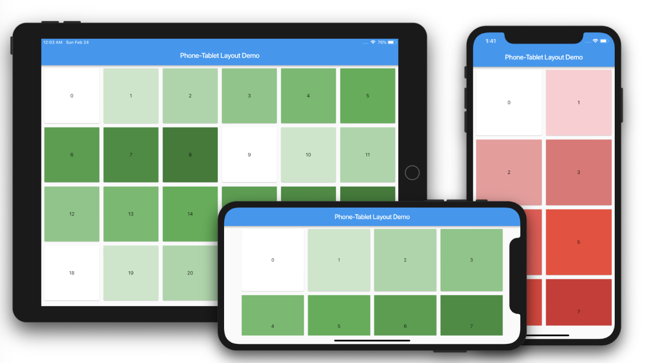
Here the Phone GridView will show 2 cells per row and the tablet will show 4 per row.
Using MediaQuery
First, we are using MediaQuery to determine the layouts. For that we will declare three variables.
We are assuming 600.0 as the boundary for tablets.
    final double shortestSide = MediaQuery.of(context).size.shortestSide; // get the shortest side of device
    final bool useMobileLayout = shortestSide < 600.0; // check for tablet
    final Orientation orientation = MediaQuery.of(context).orientation; // get the orientation
Now our build method will change to
  @override
  Widget build(BuildContext context) {

    final double shortestSide = MediaQuery.of(context).size.shortestSide; // get the shortest side of device
    final bool useMobileLayout = shortestSide < 600.0; // check for tablet
    final Orientation orientation = MediaQuery.of(context).orientation; // get the orientation

    return Scaffold(
      appBar: AppBar(
        title: Text(widget.title),
      ),
      body: useMobileLayout
          ? gridviewForPhone(orientation)
          : gridviewForTablet(orientation),
      ...
Now we will change our methods to
  gridviewForPhone(Orientation orientation) {
    ...
    GridView.count(
      crossAxisCount: orientation.portrait ? 2 : 4
    ...
  }

  gridviewForTablet(Orientation orientation) {
  ...
   GridView.count(
     crossAxisCount: orientation.portrait ? 4 : 6
  }
Using LayoutBuilder
Here is the sample that does the comparison
  LayoutBuilder(
    builder: (BuildContext context, BoxConstraints constraints) {
        if (constraints.maxWidth < 600.0) {
            return gridviewForPhone();
        } else {
            return gridviewForTablet();
        }
  },
To keep it simple we are just checking the maxWidth of the device using the builder constraints.
So Once your device exceeds the maximum width of 600.0, probably in landscape mode it will end up showing the tablet GridView.
Source Code
Complete Source code can be found in this link.